Managing Color Temperature for Natural Skin Tones

Why do my photos look too orange or too blue?
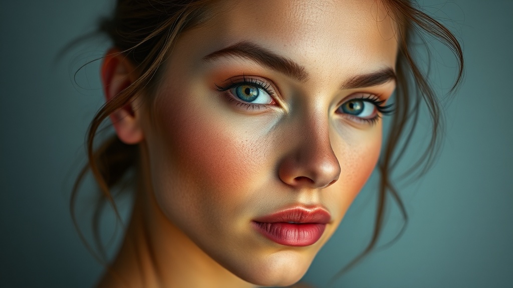
You've just finished a shoot, you've spent hours importing files, and then you see it: that sickly greenish tint or that overly warm, orange cast that makes your subject look like they've spent too much time in a tanning bed. It's frustrating. You might think your camera is broken or that your lighting was bad, but usually, it's just a matter of white balance. Understanding how color temperature works isn't just about fixing mistakes; it's about controlling the mood and ensuring your subjects look human rather than like plastic mannequins. This guide covers how to identify, troubleshoot, and correct color casts to keep your skin tones looking realistic.
Light isn't neutral. A candle flame looks warm because it emits light with a low color temperature, while a cloudy sky looks cool because it leans toward the blue end of the spectrum. When you're shooting, your camera is trying to guess the 'white point'—the point where white actually looks white under those specific light conditions. If the camera guesses wrong, everything else in the frame suffers. If you want to keep your work looking professional, you need to stop relying on the camera's 'Auto' mode and start understanding the Kelvin scale.
How do I use Kelvin settings for better accuracy?
Most digital cameras allow you to set the white balance manually using the Kelvin scale. This is a much more reliable method than selecting presets like 'Cloudy' or 'Shade.' A higher Kelvin number means the light is warmer (more orange), while a lower number means the light is cooler (more blue). For example, if you're shooting in a studio with tungsten bulbs, you'll likely need a much lower Kelvin setting than if you're shooting under bright midday sun.
To get this right, I recommend using a gray card. It's a cheap, simple tool that can save your entire shoot. By placing a neutral gray card in the light-filled area where your subject is standing, you're giving yourself a baseline. You can take a photo of that card, and later in post-processing, tell your software that the card is 'perfectly neutral.' This removes the guesswork. If you don't want to carry a physical card, you can use a tool like the Adobe White Balance guide to understand how digital sensors interpret light.
- Tungsten Light: Usually around 3200K.
- Daylight: Roughly 5500K to 6500K.
- Overcast Sky: Often dips toward 7500K or higher.
The goal isn't to make every photo look the same; it's to make sure the colors feel intentional. If you're shooting a sunset, you actually want that warmth. If you're shooting a high-fashion studio portrait, you want a clean, neutral base that you can manipulate later. If your base is off, your editing becomes a nightmare of trying to fix skin tones that have already been crushed by a bad color cast.
Can I fix color temperature in post-processing?
The short answer is yes, provided you're shooting in RAW. If you're shooting in JPEG, the camera has already baked the white balance into the pixels, and you're stuck with much less control. When you shoot RAW, the white balance data is just a metadata instruction. You can change it as much as you want without destroying the image quality. This is why professional photographers almost never shoot JPEG for high-end client work.
In programs like Lightroom or Capture One, you'll see a 'Temperature' slider. Sliding it toward the blue side cools the image down, while sliding it toward the yellow side warms it up. However, there's a catch. If you push these sliders too far, you'll start seeing digital noise and artifacts in the shadows. You're essentially trying to stretch a small amount of color data across a larger range. It's better to get it right in the camera than to try and fix a massive mistake in the computer.
When working on skin tones, pay attention to the 'Tint' slider as well. Skin isn't just blue or yellow; it also exists on a green-to-magenta axis. If your subject looks a bit sickly or 'unwell,' you likely have a green cast that needs to be countered with a bit of magenta. This is a common issue with certain LED lights or fluorescent bulbs in office settings. You can read more about the technical nuances of color science on Photographer's Sphere to deepen your technical knowledge.
Why does skin look too red or orange?
This often happens when using too much artificial light or when the white balance is set too high. If your subject's skin looks unnaturally flushed, you might need to drop the temperature or adjust the saturation of specific color channels. Instead of just lowering the overall saturation, try targeting the orange and red channels. This keeps the skin looking vibrant without making the person look like they're sunburned. It's a subtle distinction, but it's what separates an amateur shot from a professional one.
One trick I use is to look at the whites in the frame. If the white walls or the white shirt of your subject look slightly blue, then your temperature is too high. If the whites look yellowish, your temperature is too low. Use those neutral elements as your anchor. If you can get the whites right, the skin tones usually fall into place much more easily. It's all about the relationship between the light source and your sensor's interpretation of it.
| Light Source | Typical Kelvin | Color Tendency |
|---|---|---|
| Incandescent/Tungsten | 3200K | Orange/Yellow |
| Daylight/Sunlight | 5500K | Neutral/White |
| Overcast/Cloudy | 7000K+ | Blue/Cool |
Don't let the tech intimidate you. At the end of the day, photography is about seeing. Once you start noticing how different light sources change the color of a white piece of paper, you'll start seeing it in your subjects too. That's when you really start to gain control over your craft.