Why Your Portrait Skin Tones Look Muddy and How to Fix Them

Have you ever finished an editing session only to realize that the skin tones in your portraits look sickly, orange, or unnaturally gray? It's a frustrating moment—especially when you thought the lighting was perfect on location. This post breaks down the technical reasons behind skin tone discoloration and provides a workflow to ensure your subjects look their best during the post-processing stage.
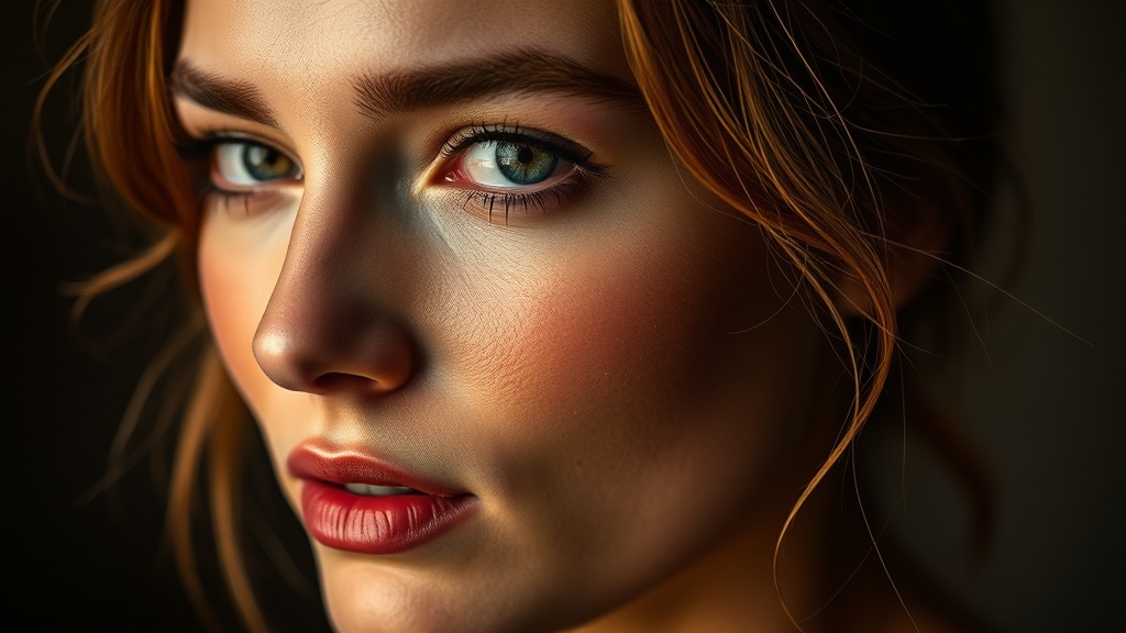
What Causes Bad Skin Tones in Digital Photos?
Most of the time, the issue isn't actually the camera—it's the interaction between your light source and your white balance settings. Digital sensors read light through a Bayer filter, which translates color data into pixels. If your white balance is off, the camera might misinterpret the warmth of a skin tone as a yellow tint or a magenta cast. This is common when shooting under mixed lighting, like a window (natural light) alongside a tungsten lamp (artificial light). One source pulls the image warm, while the other pulls it cool. The result? A messy, inconsistent color profile that's hard to fix later.
Another culprit is the color temperature of your light source. If you're using a flash without a diffuser, the light can be incredibly harsh and "hot," which blows out the highlights on the face. When skin hits high exposure levels, the color information is literally lost—a phenomenon known as clipping. Once that data is gone, you can't bring the color back without making the skin look blotchy or unnaturally red. You might want to check the technical standards for color accuracy via the Adobe Color Management documentation to see how software interprets these shifts.
How Do I Fix Skin Tones in Lightroom or Photoshop?
If you've already taken the shot and the colors look off, don't panic. The most effective way to fix this is by using the HSL (Hue, Saturation, Luminance) panel. Instead of trying to fix the whole image, focus specifically on the orange and red channels. Since human skin falls primarily within these ranges, you can adjust them independently from the background colors.
Here is a quick workflow to follow when the skin looks a bit too saturated or the wrong shade:
- Step 1: Adjust Hue. If the skin looks too red, shift the Red Hue slider toward the right (yellow side). If it looks too orange, move the Orange Hue slider toward the yellow end.
- Step 2: Tweak Saturation. Often, digital skin looks "fake" because the saturation is too high. Drop the saturation of the Orange and Red channels slightly. A little goes a long way here.
- Step 3: Check Luminance. Skin often looks better when it's slightly brighter. Increasing the Orange Luminance can give the subject a healthy, glowing look without making the photo look overexposed.
For more advanced color grading, you might want to look into the Photographerspace resources for understanding how different color profiles affect your RAW files. It's much easier to fix a photo if you've shot in RAW, as you have more data to work with when shifting these specific color channels.
Can Color Calibration Tools Help My Workflow?
If you find yourself constantly fighting with skin tones, you might need a physical tool. A color checker—like those made by Calibrite—is a tool that helps you create a custom profile for your specific camera and lighting setup. Instead of guessing your white balance, you hold the chart in the light, take a photo, and the software uses that known data to create a perfect baseline. This takes the guesswork out of the equation. It’s a bit of an investment, but if you shoot portraits professionally, it's worth it to ensure your colors are consistent across every shot in a session.
Using a color checker also helps with consistency in different environments. If you move from an indoor studio to an outdoor park, the color profile changes drastically. Having a standard to calibrate against ensures that the skin tones in your indoor shots look identical to your outdoor shots. It's about creating a predictable result rather than a lucky one.
A Quick Comparison of Color Adjustments
| Problem | Target Channel | Adjustment Direction |
|---|---|---|
| Skin too Red | Red Hue | Shift toward Yellow |
| Skin too Orange | Orange Saturation | Decrease Saturation |
| Skin too Dark/Dull | Orange Luminance | Increase Luminance |
| Skin too Yellow | Yellow Hue | Shift toward Red/Orange |
Remember, the goal isn't to make the skin look perfect—it's to make it look natural. Over-editing skin can often lead to a "plastic" look that feels jarring to the viewer. Always zoom out to 100% view to check your work, but occasionally step back to see how the skin tones sit within the context of the whole image. If the person looks like they have a sunburn, you've gone too far with the reds. If they look like they've been under fluorescent lights, you've gone too far with the yellows.