Beyond the Frame: Using Negative Space to Improve Composition

A single, weathered wooden chair sits in the middle of a vast, salt-crusted flat, surrounded by nothing but white expanse and a pale, hazy sky. The subject is small, almost insignificant, yet your eyes can't look anywhere else. This is the power of negative space. It isn't just "empty space"—it is a deliberate compositional tool used to direct attention, create tension, and provide a sense of scale. This guide breaks down how to use the areas around your subject to make your images more impactful.
Most beginners try to fill every inch of the frame with "stuff." They think more detail equals a better photo. They're wrong. Often, the more you add, the more you distract from the actual subject. By mastering the use of negative space, you learn how to give your subject room to breathe.
What is Negative Space in Photography?
Negative space is the area around and between the subjects of an image that helps define the subject's shape and presence. While the subject is the "positive space," the negative space is the "emptiness" that surrounds it. This doesn't always mean a blank white wall or a clear blue sky. It can be a blurred background, a dark shadow, or a textured surface that doesn't compete for the viewer's attention.
Think about a minimalist portrait. If a person is standing against a plain, dark backdrop, that darkness becomes the negative space. It forces the viewer to focus entirely on the person's expression or the texture of their clothing. It’s a way to strip away the noise.
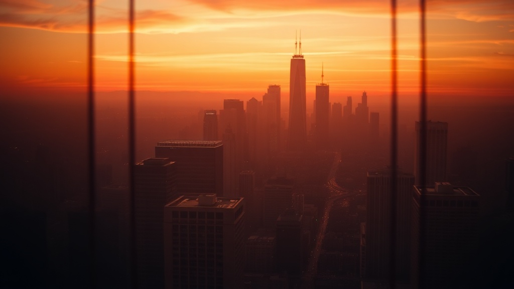
In landscape photography, negative space often manifests as a large expanse of water, a desert floor, or a heavy fog. A single mountain peak poking through a sea of clouds is a perfect example. The clouds are the negative space, providing a sense of isolation and grandeur. If you're interested in how light interacts with these environments, you might want to check out my previous piece on mastering golden hour photography to see how light can soften these large-scale backgrounds.
The Psychology of Space
Humans are wired to look for patterns, but we also find comfort in simplicity. A cluttered photo feels frantic and loud. A photo with significant negative space feels calm, quiet, and intentional. Depending on how you use it, negative space can evoke different emotions:
- Isolation: A small subject in a large void can feel lonely or insignificant.
- Minimalism: Clean lines and vast empty areas create a sense of modern elegance.
- Focus: By removing distractions, you tell the viewer exactly where to look.
It’s a subtle distinction, but it changes everything. A photographer using a Sony A7R V or a Nikon Z9 isn't just capturing pixels; they're capturing a feeling. The gear provides the resolution, but the composition provides the soul.
How Do I Use Negative Space to Improve Composition?
To use negative space effectively, you must treat the empty areas of your frame with the same leveler of importance as your subject. You don't just "leave space"; you compose it. This involves choosing a subject that stands out against its surroundings and ensuring the "emptiness" doesn't become a distraction itself.
Here are a few practical ways to implement this in your workflow:
- Look for Simplicity: Before you click the shutter, look at the background. If there's a colorful sign or a distracting branch, move your position. You want the background to be a "stage," not a "competitor."
- Use Large Apertures: If you're shooting in a cluttered environment, use a wide aperture (like f/1.8 or f/2.8) to blur the background. This turns a busy street into a soft, creamy texture of negative space. This technique is a cornerstone of creating dreamy bokeh.
- Vary Your Perspectives: Sometimes, shooting from a low angle can turn a boring patch of sand into a massive, textured foreground that acts as negative space.
- Consider the Aspect Ratio: A wide, cinematic 16:9 ratio can make a landscape feel even more expansive. A vertical 4:5 ratio can make a subject feel more isolated and tall.
The catch? If you use too much negative space without a strong subject, the photo just looks empty or poorly framed. There has to be a reason for the emptiness. The space must serve the subject, not swallow it.
Comparison: Positive vs. Negative Space
To understand the relationship, look at this comparison of how different subjects react to the space around them:
| Subject Type | Positive Space Focus | Negative Space Focus |
|---|---|---|
| Portrait | Detailed textures, jewelry, and facial expressions. | The void around the head, emphasizing isolation or mood. |
| Landscape | Intricate rock formations, trees, and paths. | The vastness of the sky or the sea to show scale. |
| The veins of a leaf or the eyes of an insect. | The blurred, out-of-focus background that isolates the detail. |
Does Negative Space Only Work in Minimalist Photography?
No, negative space is a fundamental principle that applies to almost every genre, including macro and street photography. While it is a hallmark of the minimalist movement, it's also a vital tool for creating depth and focus in complex scenes.
In macro photography, for instance, the "empty" space is often the shallow depth of field created by a macro lens. When you're looking at a tiny insect, the background isn't just "empty"—it's a soft, non-distracting wash of color. If you want to dive deeper into how to manage these tiny details, read my guide on uncovering the hidden world of macro photography.
Even in street photography, negative space can be used to frame a subject. A person walking through a dark alleyway, with the bright light of the street at their back, uses that light as a way to define their silhouette. The dark shadows become the negative space that pushes the viewer's eye toward the person. It's about the balance of light and dark.
It's worth noting that the "empty" space doesn't have to be a single color. It can be a textured wall, a field of grass, or even a crowded room that is so out of focus it becomes a singular, unified texture. The goal is to reduce the "visual weight" of the background so the subject carries the most weight.
Common Pitfalls to Avoid
I've seen many photographers fall into the trap of "accidental" negative space. This happens when you have a subject, but the framing feels awkward or unintentional. A subject stuck in the bottom corner of a huge, empty sky can look like a mistake rather than a choice. To avoid this, make sure your subject is positioned with intent—whether that's using the Rule of Thirds or placing it dead center for a symmetrical look.
Another issue is "distracting" negative space. If your background is a messy, high-contrast texture that draws the eye away from your subject, you haven't actually used negative space; you've just failed to control your environment. If you can't control the background, change your aperture or move your feet. A few inches can make the difference between a cluttered shot and a professional one.
If you're working with digital files, you can often "recover" some of this balance in post-processing. If your background is too bright and distracting, you can lower the highlights or shadows to make it more recessive. This is a common part of building a consistent color grade, where you manipulate the tonal range to ensure the subject remains the hero of the shot.
Ultimately, negative space is about the relationship between what is there and what isn't. It's about the silence between the notes. When you learn to respect the emptiness, your images will start to feel more professional, more intentional, and much more powerful.